Choosing the right paint color for your kitchen can have a major impact on the ambiance and functionality of the space. The kitchen is not just a place for cooking; it’s often the heart of the home where families gather. That’s why selecting the perfect hue is important, and Benjamin Moore is a trusted name for many homeowners. Known for their high-quality paints and a wide range of color options, Benjamin Moore provides an array of shades to suit any kitchen style. This article explores the popular recommendations of Benjamin Moore paint dealers for an inviting and stylish kitchen.
What Are the Most Popular Benjamin Moore Colors for Kitchens?
Overview of Popular Color Families
Kitchen colors can be grouped into various families, each offering a distinct look and feel. Neutral shades such as whites and greys offer a timeless appeal and blend well with various designs.
Meanwhile, more dynamic color families, such as reds and blues, can evoke strong emotions and add vibrancy. Earth tones bring a warm and grounded atmosphere, linking the kitchen to nature and promoting a sense of calm. Benjamin Moore’s expansive palette provides choices that fit every aesthetic preference and functional need.
Whites and off-whites remain timeless for kitchens, providing a clean, airy vibe. These colors can be paired seamlessly with different textures, from wood to metallics. Greys offer a sleek contemporary look, often favored for modern and industrial-styled kitchens. The versatility of these neutral shades allows them to adapt and remain relevant in design trends. Benjamin Moore’s collection showcases both classic and modern takes on these neutral staples.
Delving into more vivid color families, reds and blues stand out for their intensity and emotional influence. Red hues, like Benjamin Moore’s “Caliente,” can energize a space, perfect for lively gatherings. On the contrary, blues offer tranquility and can make a kitchen feel relaxed and cohesive. These bold families are excellent for creating standout features or accent areas within the kitchen. Balanced application is key when incorporating these vibrant shades to maintain harmony in the space.
Top Picks for Neutral Shades
Neutral shades continue to reign as top choices for kitchens due to their adaptability and ease of pairing with other elements. Benjamin Moore offers a variety of neutral hues ranging from pure whites to soft greys, ensuring options that suit every taste. “Simply White” and “Revere Pewter” are among the favorites, celebrated for their subtle elegance and warmth. These shades provide an ideal backdrop for kitchen decor, allowing artwork, accessories, and appliances to take center stage. Additionally, their understated charm contributes to a serene and uncluttered kitchen atmosphere.
The appeal of neutrals lies in their ability to magnify natural light, making spaces feel larger and more airy. Pale neutrals reflect light, augmenting the kitchen’s brightness and vitality. Shades like “Cloud White” and “Balboa Mist” are similar classics that create an inviting space for both cooking and entertaining. Benjamin Moore’s advanced formulations ensure these neutrals exhibit excellent coverage and lasting durability. With their timeless nature, these colors provide a foundation that remains fashionable despite changing trends.
Designers and homeowners love neutrals for their flexibility in working with a variety of design elements. Neutral tones help to accentuate cabinetry details, countertop materials, and even unique architectural features. The muted color palettes of neutrals offer a cohesive look that allows dynamic elements to pop effectively. These shades have proven reliable through test patches and color sampling, confirming their compatibility with diverse kitchen styles. For those seeking a sophisticated yet understated look, neutral shades from Benjamin Moore remain an enduring staple.
Bold Color Options: Reds and Blues
For homeowners seeking to make a statement, Benjamin Moore’s bold color options offer a dynamic and lively ambiance. Among these, red shades such as “Caliente” and “Red” are renowned for bringing warmth and energy to kitchens. These colors are perfect for accent walls or subtle pops of color within a predominantly neutral kitchen. As red stimulates appetite and conversation, it is ideal for kitchens where social gatherings are frequent. However, balancing boldness with neutral elements can prevent overwhelming the space.
In contrast to warm reds, blue tones like “Hale Navy” provide a sense of tranquility and sophistication. These deep blues can impart a luxurious feel to the kitchen, perfectly complementing metallic accents and white countertops. Light or aqua blues, reminiscent of coastal vibes, bring a breezy and rejuvenating feel ideal for informal dining spaces. Utilizing blues can subtly enhance the kitchen’s ambiance, evoking calmness and serenity. Their wide spectrum ensures there’s a perfect shade for every kitchen style and mood.
Benjamin Moore’s bold colors have been thoroughly tested in various lighting conditions, ensuring their vibrancy and appeal remain consistent. Designers frequently harness these vibrant options to create dramatic focal points or highlight architectural features. Exploring bold shades allows for creativity and individuality, personalizing kitchens to reflect the homeowner’s taste. When experimenting with these striking colors, sample patches are crucial to assess how the shade interacts with natural and artificial light. With careful planning, bold colors can transform a kitchen into a unique and expressive culinary environment.
Earth Tones and Naturals Recommendations
Earth tones have gained traction due to their ability to connect interior spaces with the natural world. Colors like “Timber Wolf” and “Sandy Brown” offer a grounding presence that brings warmth and comfort to kitchens. These shades strike a balance between traditional and contemporary aesthetics, providing a versatile backdrop. Earth tones effortlessly harmonize with wood cabinets, granite counters, and green accents that highlight their natural roots. Incorporating these comforting hues into a kitchen can evoke a sense of coziness and connection to nature.
The welcoming nature of earthy shades makes them excellent for kitchens, promoting a home-like atmosphere. Benjamin Moore’s assortment of earth tones reflects an appreciation for organic beauty, perfect for kitchens with rustic decor. Rich browns, deep siennas, and soft taupes offer layering possibilities that add depth to kitchen spaces. These colors adapt well to traditional wooden furniture and modern steel appliances alike, ensuring a cohesive look. The soothing appeal of earth tones fosters a serene environment that enhances culinary creativity.
Integration of natural hues in kitchens aligns well with current sustainable design trends. By using sustainable paint options, like low VOC formulations from Benjamin Moore, homeowners can achieve a nature-inspired look with ecological consciousness. These trendy earth tones endure the ebb and flow of design trends, ensuring kitchens remain stylish and relevant over time. With a focus on durability and easy maintenance, Benjamin Moore’s paints ensure these natural colors age gracefully. The overall effect is a timeless kitchen space that reflects an intrinsic harmony with the world outside.
Popularity Over Time: Color Trends
Kitchen color trends evolve, reflecting cultural shifts and lifestyle changes. Over time, what has consistently emerged is the consumer’s desire for both individuality and timelessness in kitchen colors. Benjamin Moore has long been at the forefront, adapting their palette to cater to these evolving tastes. Popular colors often mirror the zeitgeist, with serene pastels reflecting calmness in hectic times and vibrant bolds capturing optimism and energy. The flexibility and ingenuity of Benjamin Moore’s colorists ensure they can anticipate trends while maintaining a focus on enduring style.
Classic hues, like “White Dove” or “Shaker Beige,” remain favored for their timelessness and versatility, adapting to changing decors. Meanwhile, trendsetting colors such as jewel tones or muted pastels nod to contemporary preferences for personalized and emotive spaces. In recent years, there has been a shift towards colors that signify comfort and wellness, as kitchens evolve into multifunctional living spaces. Benjamin Moore’s annual Color of the Year announcement often sets the stage for upcoming trends and designer focus. By adopting these trends, homeowners can keep their kitchens feeling fresh and current while leveraging time-tested shades for balance.
Color durability is an essential factor in Benjamin Moore’s popular selections, as they blend style with long-term functionality. High-quality pigments ensure that Benjamin Moore paints maintain their vibrancy and integrity, even under intense kitchen conditions. Customer feedback highlights the satisfaction of using these reliable color options that not only meet aesthetic needs but also practical demands. Consequently, when choosing color trends from Benjamin Moore, homeowners can trust in both fashion-forward design and resilient performance. This synergy between trend and practicality makes Benjamin Moore a go-to choice for kitchen updates and revamps.
How Do I Choose the Right Benjamin Moore Paint Color for My Kitchen?
Understanding Lighting Impact
Lighting plays a crucial role in how paint colors appear in the kitchen. Natural light can highlight undertones, causing shades to look different at various times of the day. Benjamin Moore offers a diverse palette that considers these variations, ensuring color integrity in all lighting conditions. For instance, cooler tones might look more vibrant in bright, well-lit kitchens, while warmer hues may add coziness to dim corners. Proper lighting considerations can ensure that the chosen color upholds its intended look, regardless of daylight or artificial lighting.
Artificial light sources, such as LED and incandescent bulbs, can affect how colors are perceived in kitchen settings. LED lights typically emit cooler light, which might enhance blues and greens but could make warmer colors feel duller. Alternatively, incandescent lights emit a warmer glow, enriching reds and yellows but may distort cooler shades. Understanding this interplay helps homeowners select paints that maintain their beauty day and night. Benjamin Moore’s range is versatile, factoring in such lighting variables to offer consistent performance.
To make informed decisions, homeowners are advised to test paint samples in their kitchens. Sampling helps in witnessing firsthand how colors interact with specific lighting setups. Applying test patches under different lighting scenarios—day, twilight, and night—presents comprehensive insight into color behavior. Benjamin Moore encourages this process, clear evidence of their commitment to customer satisfaction and informed choice. Consulting with their specialists can also provide valuable tips tailored to optimize the interaction between lighting and paint colors.
Matching with Kitchen Cabinetry
The interaction between wall colors and kitchen cabinetry plays a decisive role in shaping the kitchen’s ambience. Finding a harmonious balance ensures a cohesive look that enhances both the cabinetry and the overall decor. Light cabinetry pairs well with contrasting dark walls for a modern look, while dark cabinets excellently complement lighter shades for a classic style. Benjamin Moore provides a variety of complimentary shades ideal for maximizing cabinetry appeal. Thoughtful color coordination enhances not just aesthetics but also functionality, optimizing the kitchen’s usability.
Playing with opposing colors can draw attention to architectural features, such as ornate cabinetry and crown molding. For a stylish two-tone effect, combining “Chelsea Gray” with “Decorator’s White” can strike a perfect balance. Likewise, choosing colors close on the color wheel creates a more uniform, seamless transition between surfaces. Benjamin Moore’s extensive range ensures a plethora of options to meet any cabinetry style, from shaker to contemporary. This flexibility allows homeowners to experiment with varying degrees of boldness, all while maintaining unity within their design.
When remodeling, many also choose to coordinate cabinetry and wall colors with hardware finishes to achieve a holistic design. Warm colors paired with brass or gold hardware can create a vintage appeal, while cooler paints complement stainless steel or chrome. Benjamin Moore’s experts can guide homeowners through suitable paint and cabinet combinations, ensuring the end result is cohesive and charming. Utilizing this strategy results in kitchens with distinct personalities and a professional look. Information from color sampling and expert consultations can direct these choices toward successful execution, reflecting individual style.
Considering Kitchen Size and Space
Decision-making for kitchen paint colors involves an understanding of spatial dynamics. Lighter shades such as “Chantilly Lace” can make small kitchens feel more open and expansive. Conversely, deeper tones can add dimension, making larger spaces feel more intimate and cozy. Strategic use of color can also emphasize or downplay specific areas, creating focal points that guide eye movement. These techniques allow homeowners to manipulate perceptions, enhancing usability and atmosphere.
Neutral colors serve to open up compact spaces by reflecting light and improving spatial flow. Benjamin Moore’s array of neutrals, like “Classic Gray” and “Pale Oak,” are celebrated for their light-enhancing qualities. These colors successfully recede into the background, providing a blank canvas that highlights other decor elements. Combined with reflective surfaces such as glass backsplashes, they can transform the perception of size in compact kitchens. The intricate blend of functionality and aesthetic pleasure makes these colors ideal for small area solutions.
Larger kitchens benefit from the depth provided by dark or mid-range shades, lending character and welcoming intimacy. Benjamin Moore’s rich tones, from “Hale Navy” to “Kendall Charcoal,” encourage grounded designs that feel solid and serene. These shades break up expansive walls, creating defined zones that add interest and variation. With bold colors or daring contrasts, larger kitchens can engage mix-and-match strategies for a dynamic appearance. Thoughtful planning and experienced advice ensure colors complement overall kitchen design, no matter the space size.
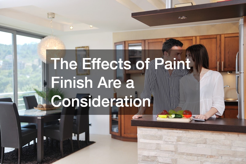
The Effects of Paint Finish
Paint finish can significantly impact both aesthetics and functionality, complementing the selected hue. Each finish—from matte to high gloss—serves a specific purpose, enhancing or muting the overall color effect. For kitchens, Benjamin Moore frequently recommends finishes that offer both durability and appeal, such as satin and eggshell. Satin finishes offer a delicate sheen, adding subtle sophistication suitable for kitchen walls that are sometimes subject to moisture. Meanwhile, a glossy finish might be reserved for trims or highlights, providing easy-clean surfaces with reflective qualities.
Finishes also contribute to the spatial perception, with matte absorbing light and glossy finishes reflecting it. A matte finish camouflages minor imperfections and might be used for a rustic or natural effect. Conversely, semi-gloss and gloss finishes enhance modern aesthetics, lending a polished, contemporary appearance. Benjamin Moore’s vast selection of finishes allows customization based on stylization preferences and practical needs. Assessing practicalities such as cleaning requirements against the desired aesthetic helps achieve the right balance.
Durability considerations dictate that high-traffic areas, such as kitchens, employ finishes that withstand consistent use. Benjamin Moore’s advanced technology ensures all finishes, from matte to gloss, are equipped for longevity and easy maintenance. These finishes facilitate cleaning, ensuring surfaces remain pristine despite spills and splatters. Proper finish selection can make kitchen upkeep more manageable without sacrificing style or color brilliance. Expert guidance can assist in matching specific kitchen areas with finishes conducive to both beauty and durability.
Test Patches and Color Sampling
Benjamin Moore advocates for thorough testing before final color selections for kitchens, employing test patches and sampling. Simulating how colors will react with lighting and surrounding decor helps ensure satisfaction with the chosen hue. Test patches applied on different walls provide a comprehensive view of how shades interact across a culinary space. This stage in the painting process prevents unexpected outcomes, allowing homeowners to observe colors over different lighting conditions. It can be influential in verifying color interactions with floorings, cabinets, and appliances for complete design integration.
Samples further benefit those balancing between multiple color options by offering concrete visual comparison. Painting swatches directly onto walls allows homeowners to test perceived and actual color effects over time. Most professionals affirm that observing colors throughout day and night provides insight into transformative aspects. Noting personal reactions and preferences at this stage can guide informed decisions, preventing costly repainting. Benjamin Moore’s generous array of available samples caters to exploration, empowering homeowners to tailor spaces to their vision.
Engaging with color samples before committing affirmatively impacts overall satisfaction with kitchen makeovers. Professional advice emphasizes that time and consideration during this stage reflect professional methods that lead to optimal results. Working through a comprehensive selection and sample phase followed by contemplation is vital to leveraging Benjamin Moore’s color prowess. Alert attention during sampling demonstrates color endurance, consistency, and suitability for the kitchen’s environment. Armed with these insights, homeowners successfully realize individualized kitchen settings crafted precisely to personal tastes.
Why Do Benjamin Moore Specialists Prefer Certain Colors for Kitchens?
The Influence of Marketing and Trend Reports
Benjamin Moore’s specialists base their color recommendations on in-depth market analysis and trend forecasting. This approach ensures recommendations align with evolving consumer expectations and stylistic shifts within the paint industry. Marketing strategies enable Benjamin Moore to closely monitor color popularity, making informed decisions on their palette offerings. This data-driven method impacts the colors considered best for kitchens, marrying contemporary trends with classic elements. Consequently, customers benefit from selections that are both fashionable and suitable for practical kitchen requirements.
Report insights reveal consumer inclinations towards sustainability, leading to a prevalent push for eco-friendly paint options. In response, Benjamin Moore has integrated low VOC formulations, broadening appeal within environmentally conscious circles. Trend reports project this inclination into specific preferred color families that communicate wellness and health, such as greens and light blues.